In this project, I collaborated with a team to establish the foundation for Lasso's mobile experience. My contributions include leading client communication, conducting user research, and taking the primary role in designing the app’s interface and interactions.
I am now independently developing the app further, focusing on refining the user experience and visual design. This case study highlights the research conducted by the group, along with my own design iterations.
Design an app that drives adoption, maximizes usage, and builds customer loyalty for Lasso's recycling appliance.
Created a user-tested mobile prototype featuring smart control, container status, recyclability scanning, and environmental impact.
UX Designer
Sep 2024 - Jan 2025
Jiayi Huang, UXD
Justin Lee, UXR
Yidi Lin, UXR
Tobias Van Eeckhout, SWE
The Lasso transforms recyclables into pure, manufacturer-ready materials. Unlike traditional recycling systems, it ensures that materials are processed efficiently. For this project, the client approached us to design an app that would complement the appliance experience.

To make sure the app complements the Lasso recycling experience, we first needed to figure out what was missing.


We started with stakeholder interviews to understand business objectives and define core app features, then conducted user interviews to uncover user preferences and identify key trends.


How could we structure the app to effectively organize all required features while ensuring the design remains engaging and aligned with user expectations?
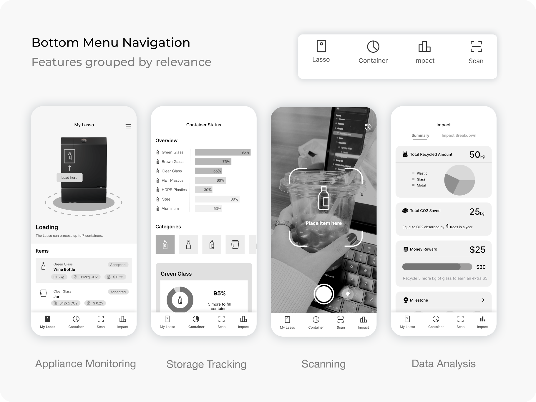

Users are familiar with the standard bottom menu navigation
Thumb-friendly, particularly useful for one-handed use

Key features are not immediately visible, creating a learning curve for first-time users
Notifications are scattered
Task flow can be interrupted if users have to switch between tabs


All key features visible on the homepage
Gentle learning curve
Eliminates visual clutter and reduces cognitive load
Users are less familiar with no bottom menu
More navigational layers
I aligned the app's flow to mirror the physical appliance experience while minimizing problems that might happen when people are holding the phone with one hand.

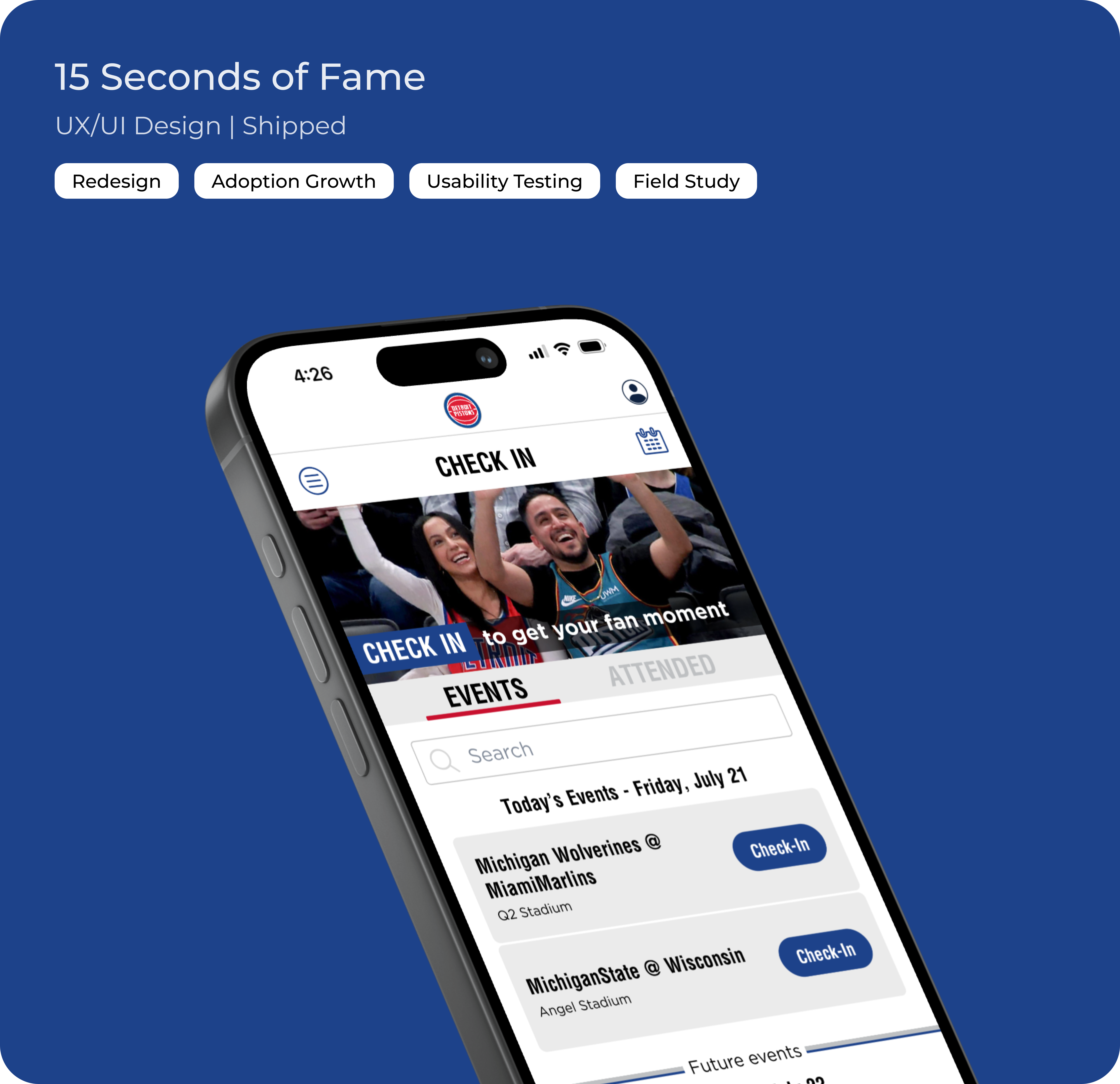
The homepage delivers a synchronized experience between the mobile app and recycling appliance. Every physical interaction with the appliance is instantly reflected in the app interface, creating a natural, unified workflow.


Our research indicates that users value clear visibility into their recycling performance as a motivational tool, but prefer not to spend excessive time analyzing data. Here’s how I incorporated simplicity in presenting data.


The scanning feature allows users to check the recyclability and Lasso compatibility of potential purchases. Based on discussions with the engineering team, I have also incorporated a feedback system where users can report misidentified items to help refine the scanning accuracy.

From day one, we brought together our cross-functional team of mechanical engineers, software engineers, and business strategists - and it made all the difference!
The constant communication about user flow feasibility, technical constraints, and potential implementation challenges allowed us to create user experiences that were both innovative and technically executable.
I used to see documentation as the most tedious part of the job. However, throughout this project, I discovered its profound value beyond simply tracking progress.
Thorough documentation not only captured our entire design journey—including key decision points, user research insights, and technical constraints—but also served as a guide when we got lost in the details. Sometimes, stepping back to review documentation can reveal answers and inspire new directions!